Close
 

Contact Us

Mobile Ready ? How It Works ?

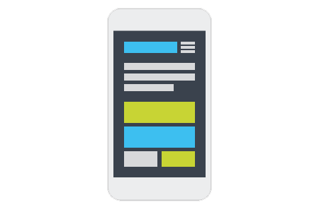
Get your website and work on multiple mobiles devices NOW!

Alignment

A proper alignment of text increase your browsing experience.

Browsers

Suitable to use for all browser, and automatically adjust to fit multiple screen sizes.

User Experience

Displays images and content correctly on all devices help you deliver message quickly.

Scrolling

Smooth scrolling of mobile screen will increase the efficiency of browsing and economizing your time.

View

A neat designed interface for mobile screen help you understand the content in 1 sec.

Anywhere

Convenient to use, and able to access ANYWHERE at ANYTIME.

Fast Loading,
Simple and Easy Navigation

What is Mobile Flexibility Website

Mobile Website is designed specifically for the and capabilities of

mobile web design

Why It's Better to Switch to Mobile Flexibility Website

Mobile User versus Desktop User

  • Mobile usage has the desktop usage and become major digital devices in daily life.
  • Mobile website is and without zooming to view the content.
  • Scalling down screen of mobile devices help user find the information quickly and .
mobile website design

website showing graph

Mobile Usage Growth

  • Mobile usage has exceed the desktop usage and become major digital devices on daily life.
  • Mobile users now expect an experience optimized for their device.
  • Nearly half of consumers say they won't return to a website if it doesn't load properly on their mobile devices.

Effective Mobile Flexibility Websiteweb design quote

Having a mobile website is critical in business environments nowadays. Webpage needs to be optimized to function specifically for mobile devices in order to fulfill customer needs.

What is the advantages of Mobile Website ?
Increase Popularity
Enhancing Satisfaction and Comfort in Browsing
Increase Visitors
Increase accessibility
Why is Mobile Website important ?
feel comfortable and easy to get what they want
feel professional, responsible and sincerely to their company
save a lot of time, better reading
users said they were more likely to purchase a product or service via mobile flexibility websites.

Mobile Website Demo

With Responsive Mobile Design

Without Responsive Mobile Design

mobile design service

Frequently Asked Questions about Mobile Website Design


You've got questions? We've got answers.

According to study, about of the people surf the Internet with mobile phone, and most of them will do it at least per day.
With our mobile website deisgn service, you can get improved , provide a better user , offer a much more for viewers.
Mobile Website can help customers to find their information quickly because it has a easy, simple navigation that is , formatted content for maximum , and a large graphics with white-space borders for those of us with large or clumsy fingers.
Mobile websites are specifically designed to render correctly (or "look right") on a mobile device. Because of small screen size, users are immediately guided to via a design that's suited to the most likely needs of someone using a mobile device. Mobile website is inevitable for SEO since the roll of Mobile First algorithm.
No, when you updates to your main websites, the updates will appear on your mobile websites too.
Your mobile website will not have the as your desktop view. The arrangement will change in order to provide a nicer view in the mobile screen.
Make an appointment with us by sending us an or call us at , and let us discuss your project.
You can contact us by sending an or call us at to show your questions. You can also drop us an email to [email protected]. We would love to discuss and solve your problems.
Contact Us
Call us for More Information !
+6010 - 276 0878
(click to Whatsapp Chat)


OR

Write us an email ;-)

Copyright © 2007 - 2024 Operion Ecommerce & Software Sdn Bhd

Send Message ( +6010 - 276 0878)